
Dorine Berman · Solo designer · 2025
Figureit pulls scattered
business tools into
one clear picture.
The model was meant to be self-serve. A user could sign up and get to value on their own. But the flow had no product evidence yet, and the brand was still loud and glowing, not yet the kind of thing that earns trust on sight.
The First Screen
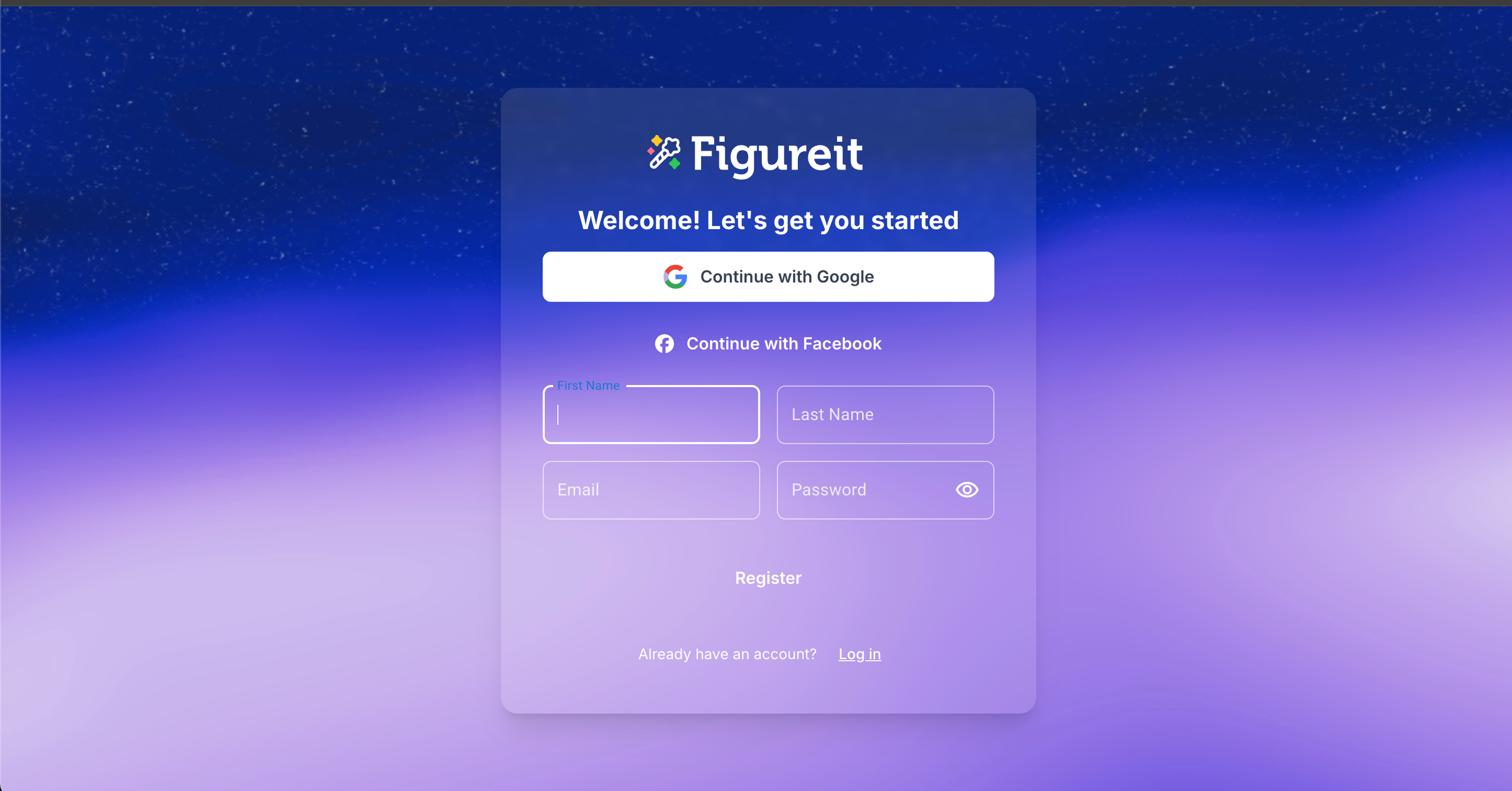
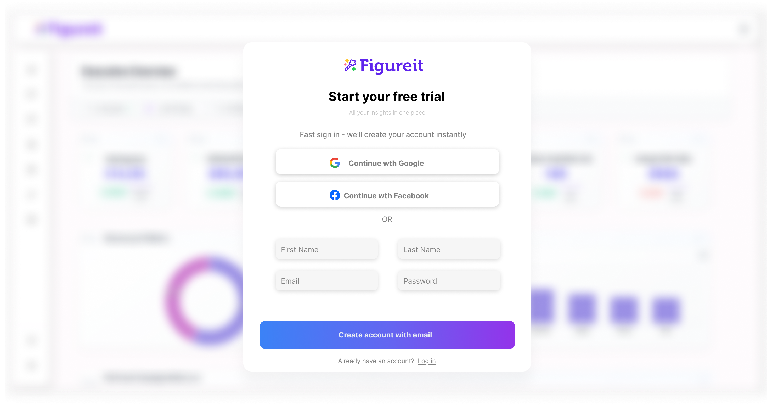
The signup screen went from a loud gradient form to a quiet modal over the real product.
People judge a product before they have used it. Nielsen Norman Group calls it the gap between perceived and actual value. The modal sits over a live preview of the dashboard, so they judge the real thing, not an empty form.
Before and after. Same step, same fields.
Connect Your Data
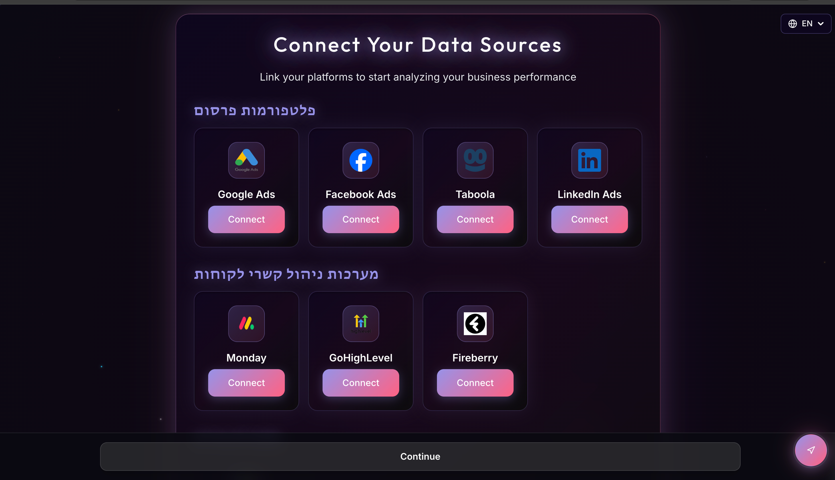
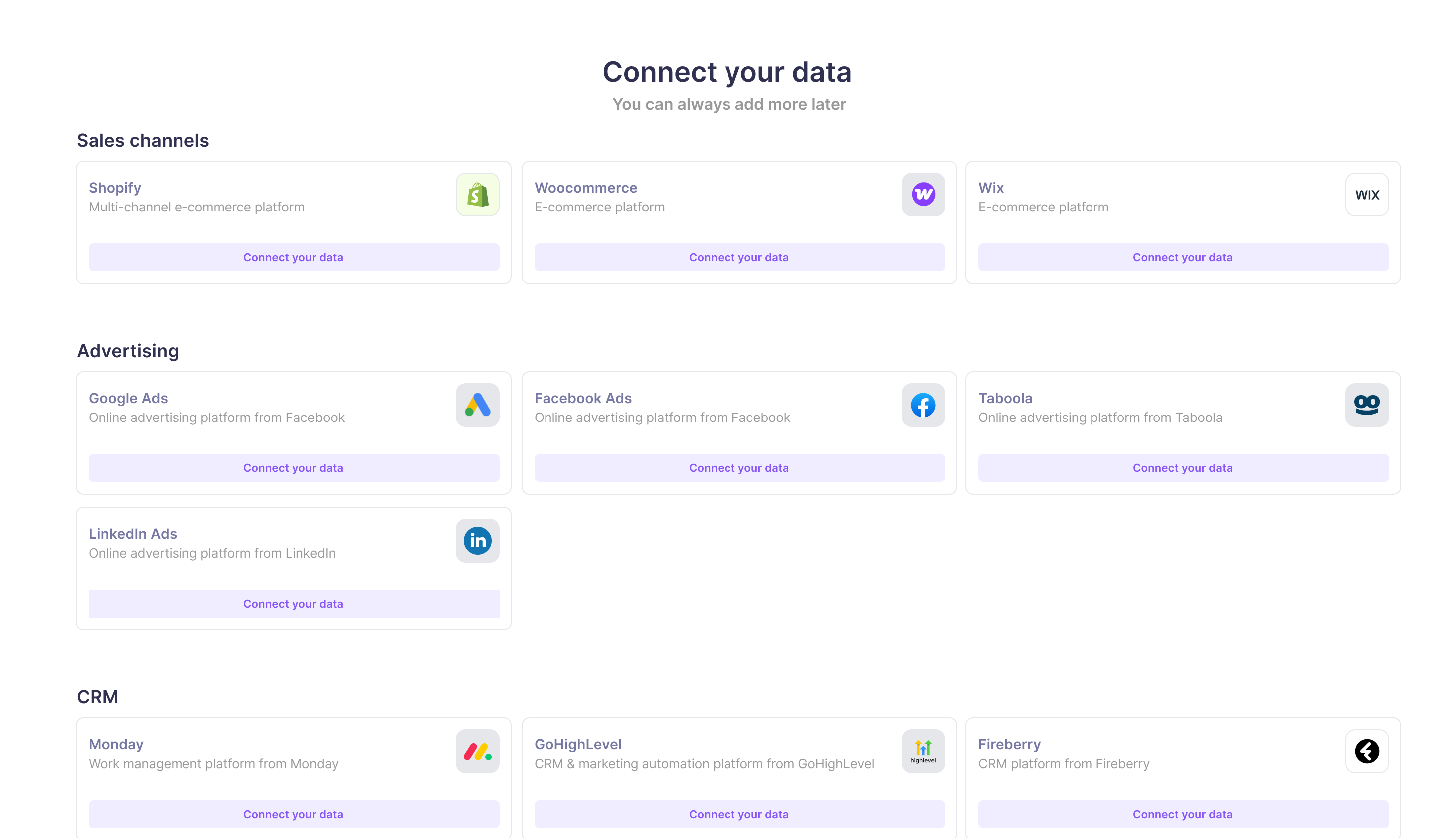
The activation step.
Two dense categories became five,
each one explained.
Before and after. The activation step, rebuilt.
One Path
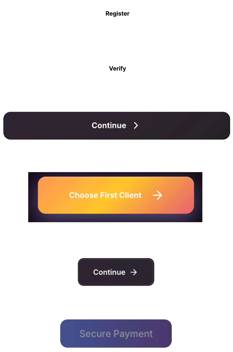
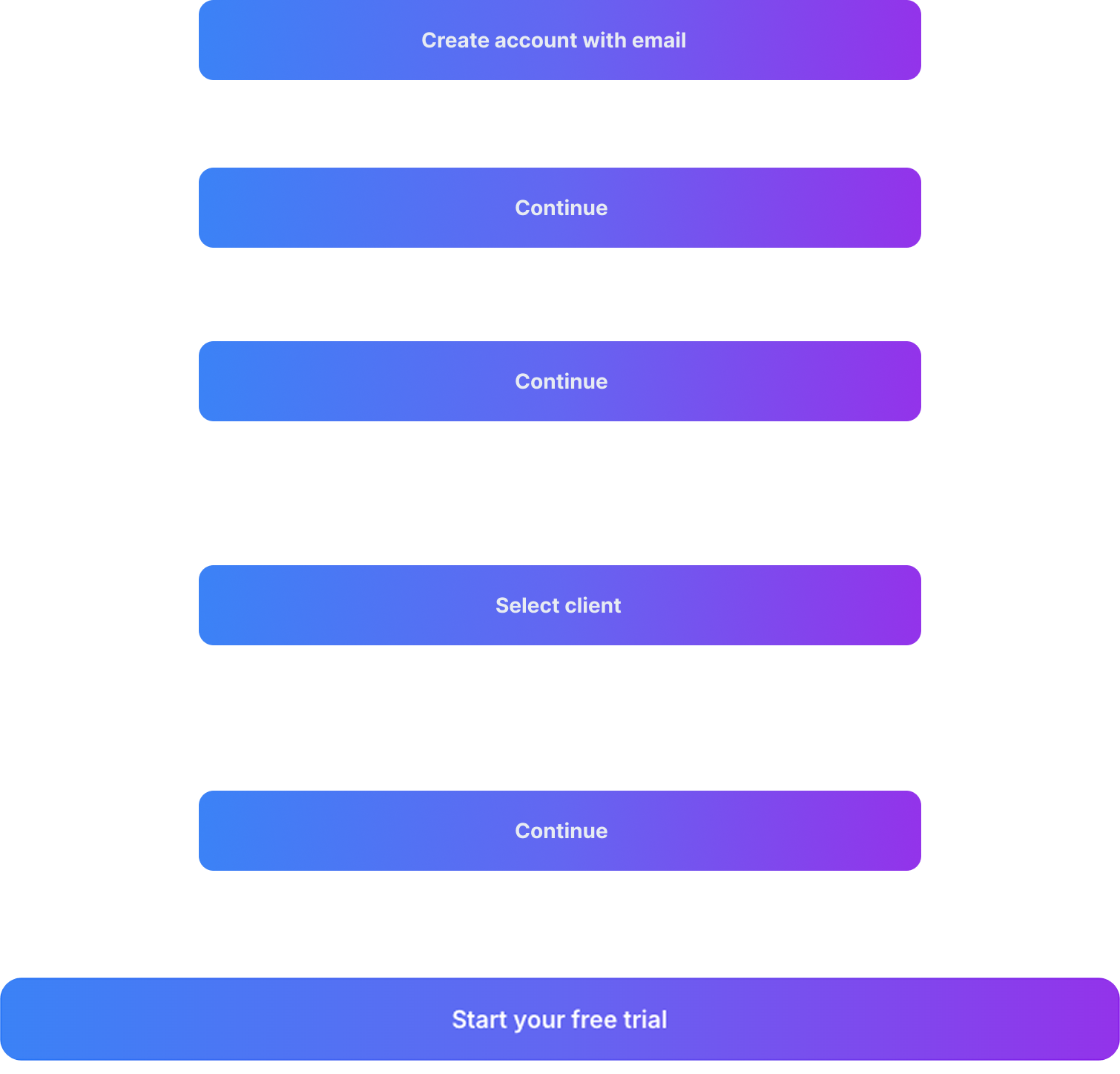
Every screen had a different button.
The redesign made the way forward the same every time.
When the primary action keeps changing position and style, people hesitate. One consistent button removes that friction.
Before
After
The live flow. Signup to connected data.
People used to leave before connecting any data.
After the redesign, they got through it on their own and reached activation.
That self-serve path was the goal, and the funnel made it work.
FigureIt
First version
Idan Bar Dayan — CEO
Alon Berman — CTO
Dor Nakash — Full Stack Engineer
Redesign
Dorine Berman