
DORINE BERMAN · SOLO DESIGNER · 2025–ONGOING
A dashboard that worked.
Just not fast enough
to read.
Figureit unifies ERP, POS, payroll and CRM into one view. The founders shipped v1 with AI. I redesigned the product, mobile, and bilingual experience.
Designed and shipped to production.
The Dashboard
The same data.
Ordered so the screen
tells you where to look.
The old design had no hierarchy. Everything competed for attention at the same time. Numbers, trends, labels and headers all asked to be read first. The redesign gave each element one job and one place in a sequence so the screen could tell you where to look without asking you to decide.
The old design had no hierarchy. Everything competed for attention at the same time. Numbers, trends, labels and headers all asked to be read first. The redesign gave each element one job and one place in a sequence so the screen could tell you where to look without asking you to decide.
Before and after. Same screen, same data.
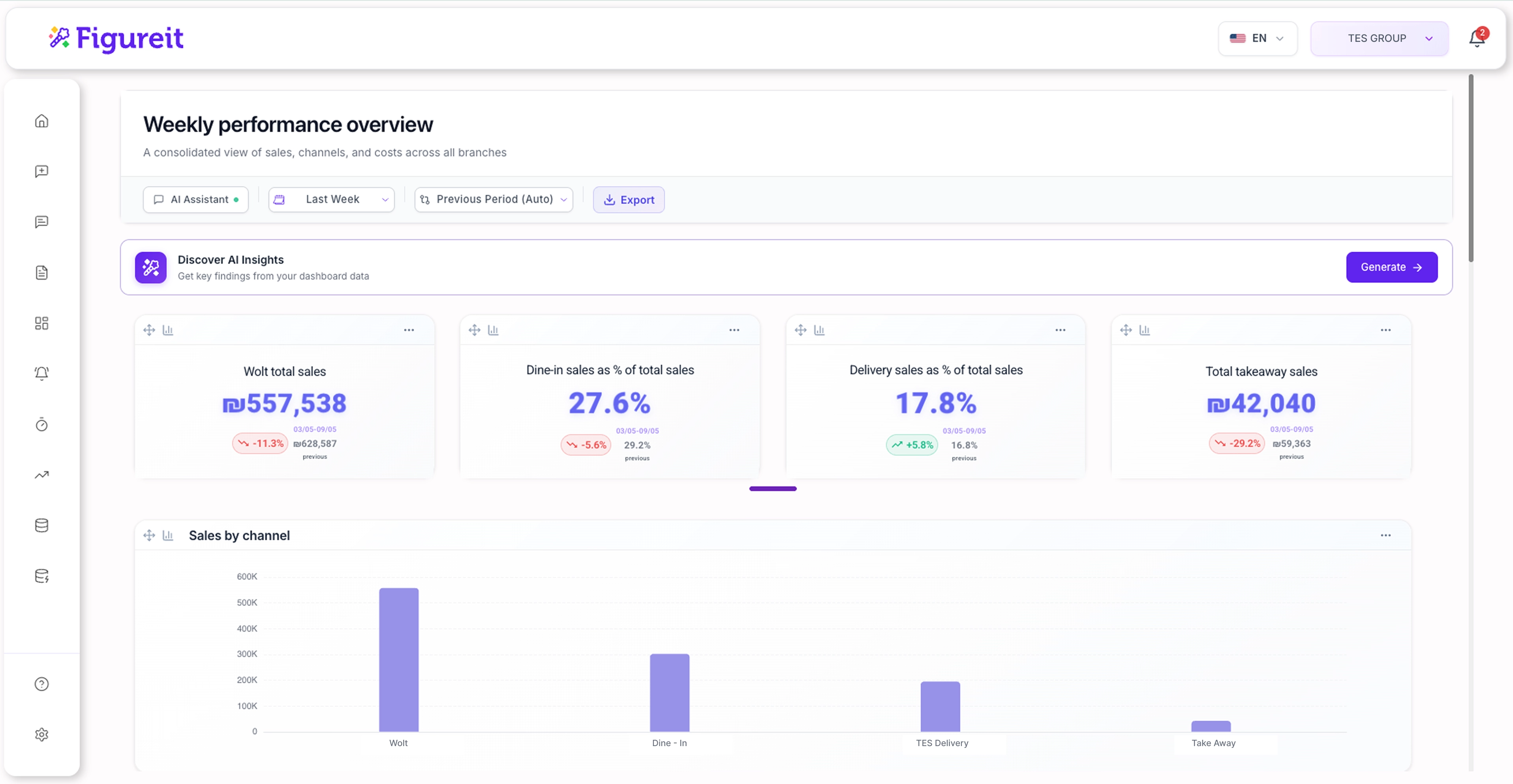
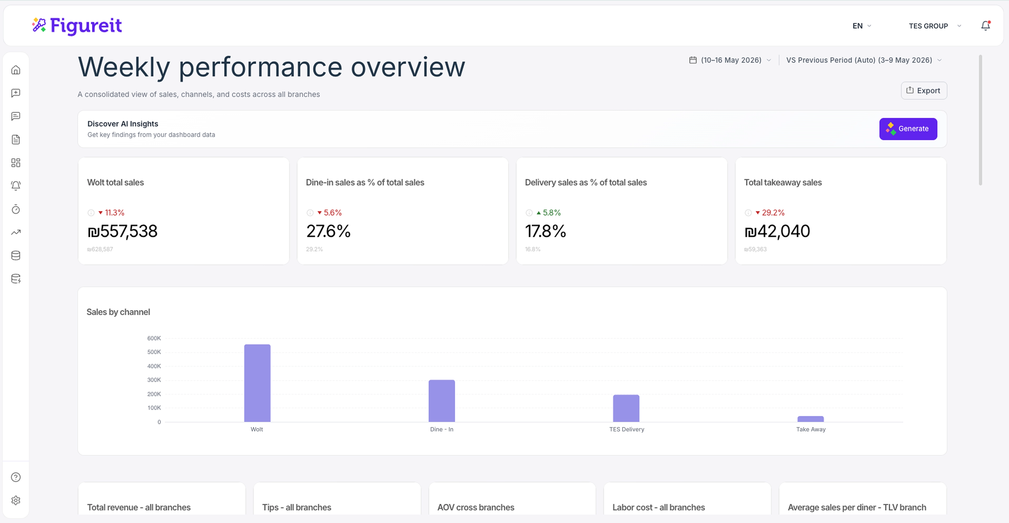
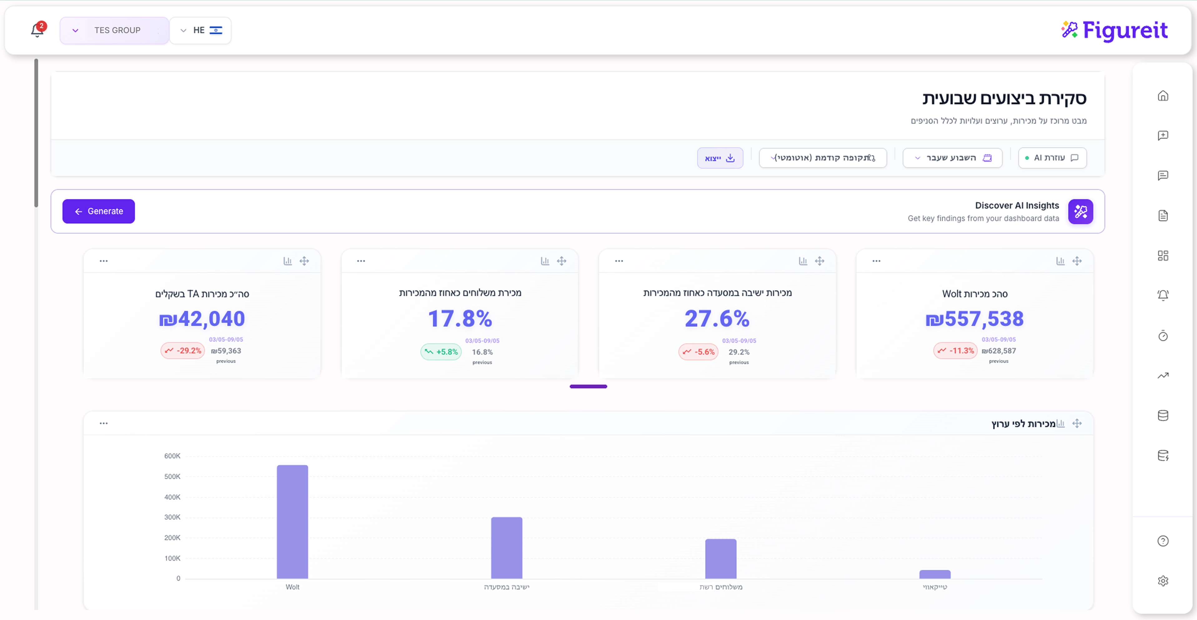
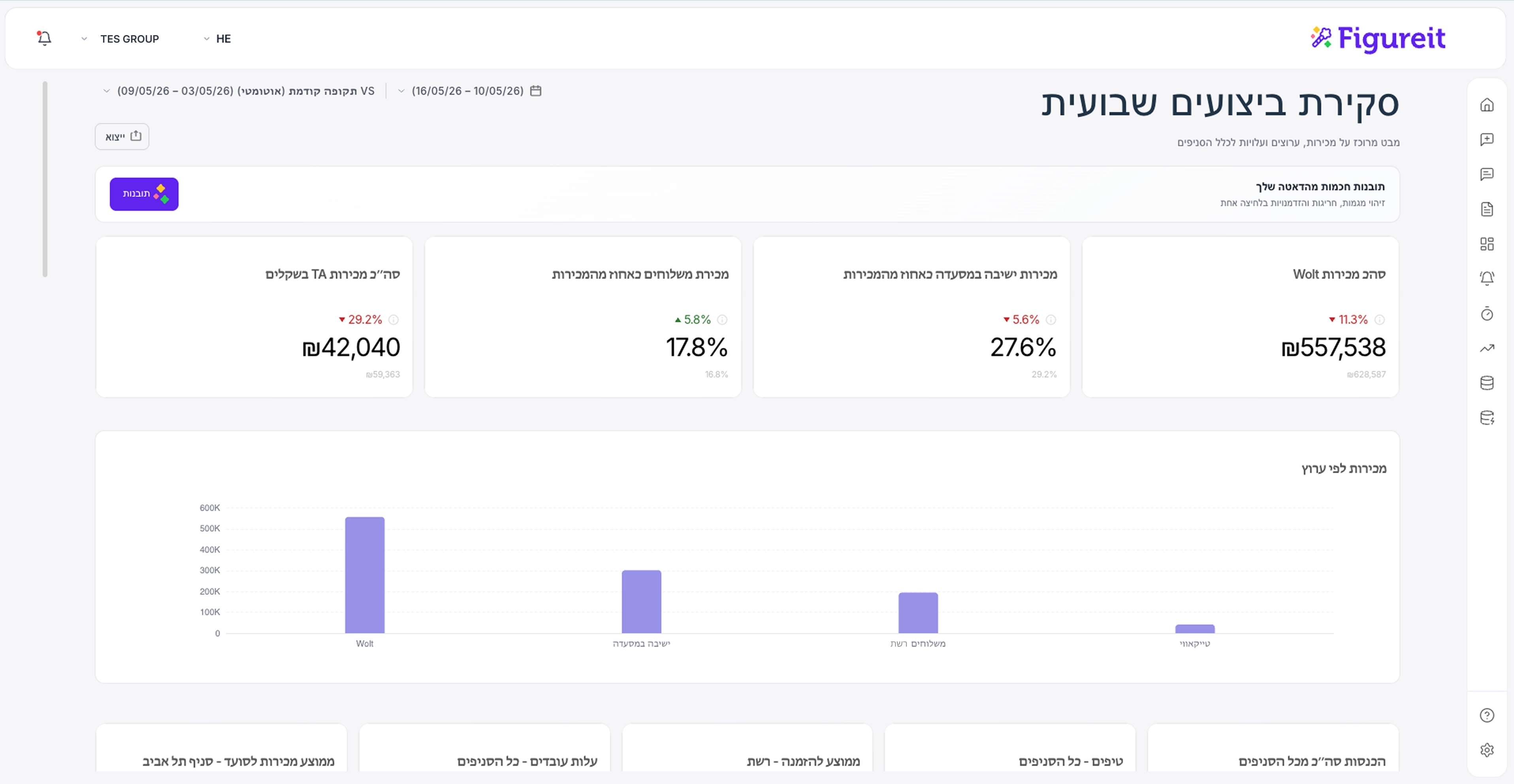
Before and after. At the same level of investment as LTR.
The KPI Card
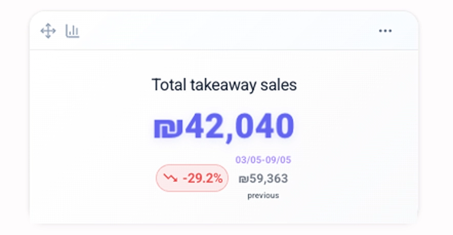
The card had three elements fighting for the same attention.
The redesign gave the number the first read.
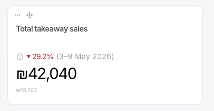
The comparison dates used to sit on every card, always visible, adding to the noise. The redesign moved them behind a small info icon. The resting state stays calm. The dates are one hover away.
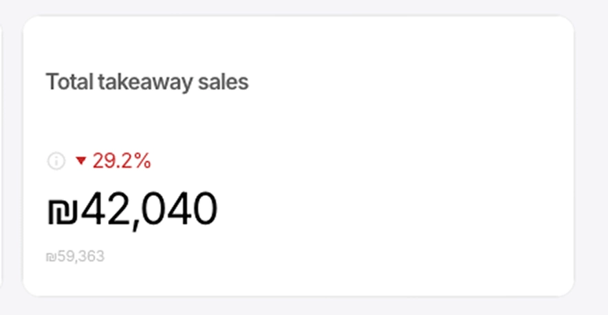
The previous value sits directly below the number.
A percentage without a baseline is not a number you can act on.
The controls work the same way. Present when you reach for them, invisible when you don't.
One hover surfaces the comparison dates and the card controls together. Nothing is on screen until it is needed.
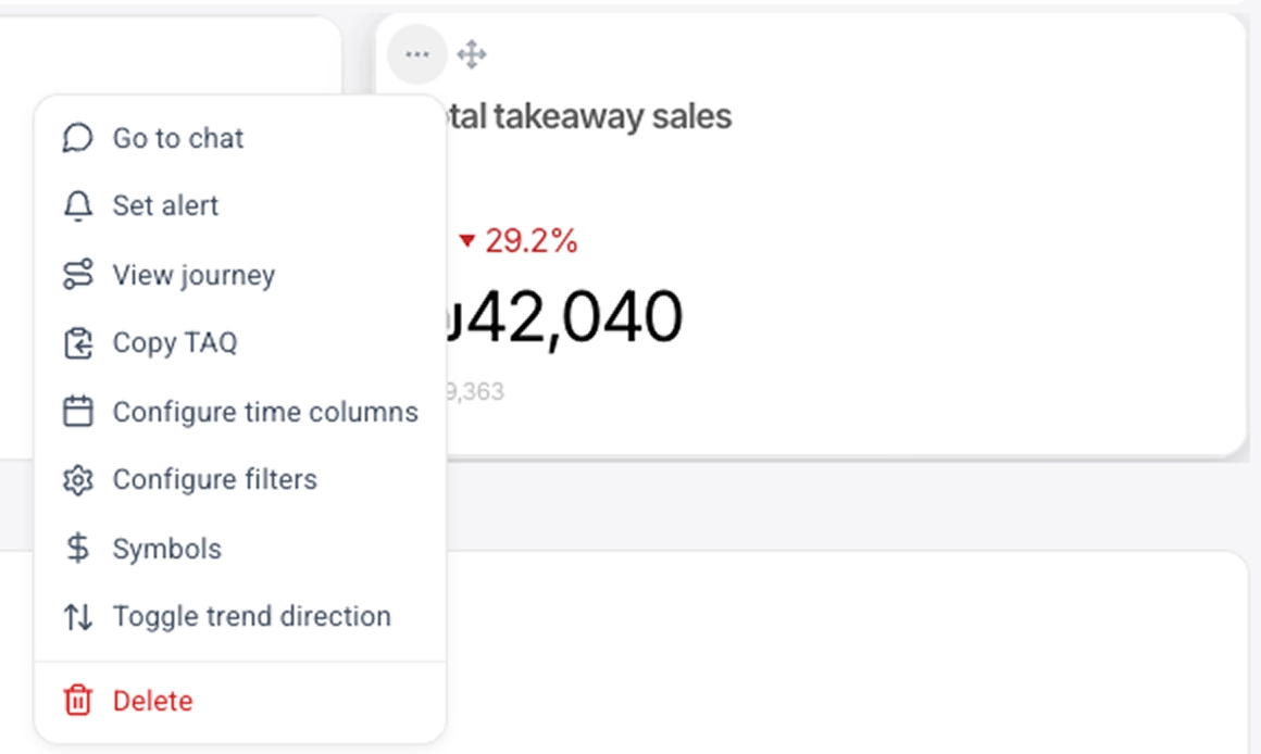
The menu was reorganised
around how the card
actually gets used.
The alert moved from a floating button into the menu. Delete got its own line. Deleting a metric is irreversible, so it shouldn't sit in the same list as everything else.
EVERY CARD
GOT THE SAME TREATMENT.
NUMBER FIRST.
CONTEXT UNDERNEATH.
CONTROLS ON DEMAND.
AI Insights
It was loud and hard to scan.
Borders, color labels,
colored edge lines.
Everything competing.
The redesign made the classification
visible
before you read a word.
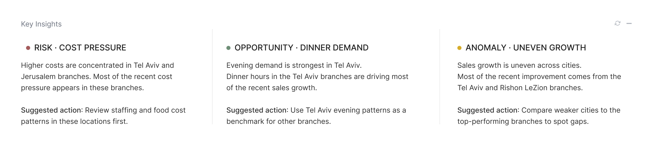
Each insight was given a type. Risk, opportunity or anomaly. The type was made visible before the detail so a manager scanning three insights could orient before reading. Color carries the type at a glance. The word confirms it for anyone who needs the text to be sure.
Before and after
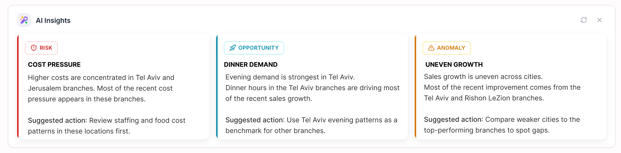
Before and after. Classification visible at a glance.
On Mobile
The same scroll position.
The old design showed one card and a half.
The redesign shows four, without hiding any data.
The dashboard existed on desktop. Extending the redesign to mobile meant the same clarity was available wherever they were.
Before and after
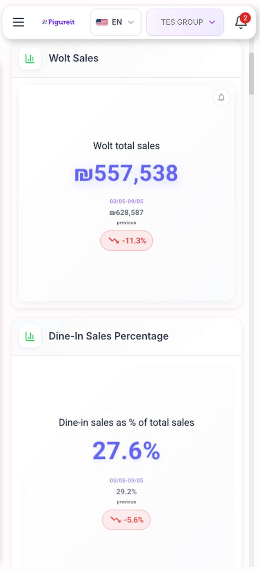
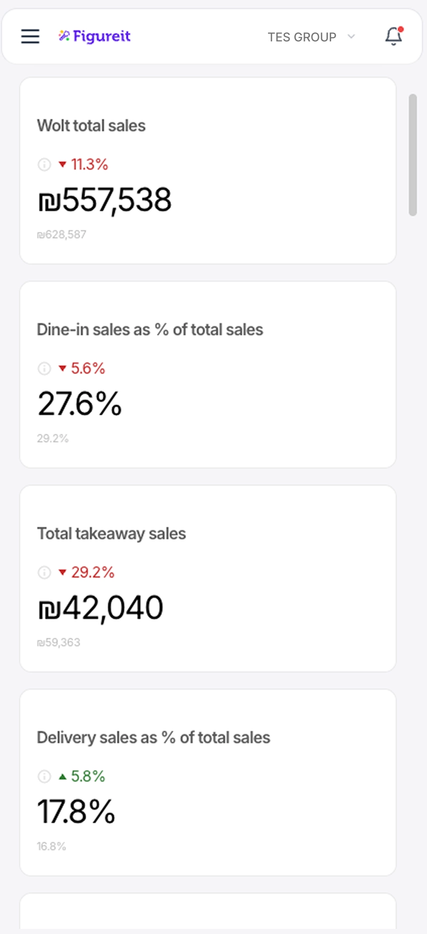
The dashboard existed on desktop. Extending the redesign to mobile meant the same clarity was available wherever they were.
THE OPERATOR SHOULD NEVER HAVE TO THINK ABOUT THE SCREEN.
ONLY ABOUT THE BUSINESS.
Figureit
Original product
Idan Bar Dayan — CEO
Alon Berman — CTO
Dor Nakash — Full Stack Engineer
Redesign
Dorine Berman — Solo Designer
Designed in Figma, built and shipped to production.